Data Visualisation Library
Empowering insights through dynamic data visualisations.
The development of a data visualisation library creates a comprehensive tool for analysing and interpreting complex data. Adhering to data visualisation principles and design maxims, the project ensures accuracy, helpfulness, and scalability in visualisations, providing a user-friendly and intuitive experience.

The Problem
Data analysts and researchers struggle with existing tools due to limited functionality and a steep learning curve, hindering their ability to efficiently analyse and interpret complex datasets.
Research Findings
- User frustration: Through user surveys and interviews, it was discovered that many of our users, including data analysts and researchers, struggle with our understanding our data visualisations due to their limited functionality and steep learning curve of oru product.
- Inefficient analysis: Users reported spending significant time and effort manipulating and transforming data before visualising it, which hindered their ability to gain insights quickly.
- Lack of consistency: Users expressed frustration with inconsistent visual representation across the platform, resulting in difficulties in comparing and interpreting data accurately.
- Limited scalability: Existing tools often lacked the ability to handle large datasets efficiently, leading to slow rendering and performance issues.
“Extracting valuable insights from our data has proven to be a challenge. The sheer complexity of the data visualisations we encounter often leaves us feeling overwhelmed and unsure of where to start.”
Research Insights
- The library should prioritise simplicity and intuitiveness to minimise the learning curve and enable users to quickly create meaningful visualisations.
- Consistency in visual design across different visualisations and platforms is crucial for accurate interpretation and comparison of data.
- The library should be optimised for scalability, ensuring smooth performance even with large datasets.
- Providing a streamlined configuration process and offering intelligent defaults will make customisation easier for users.
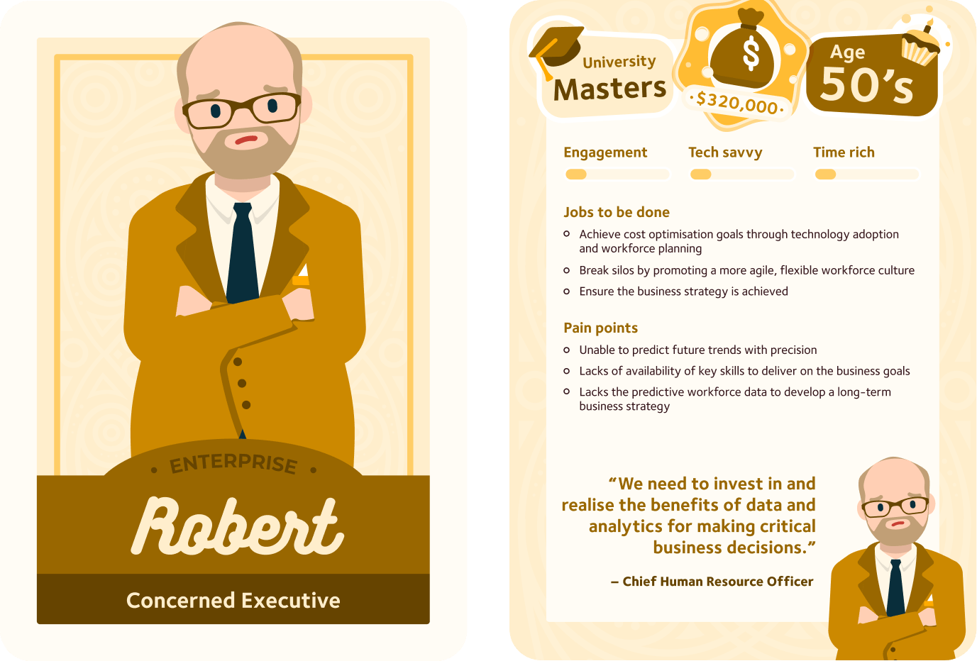
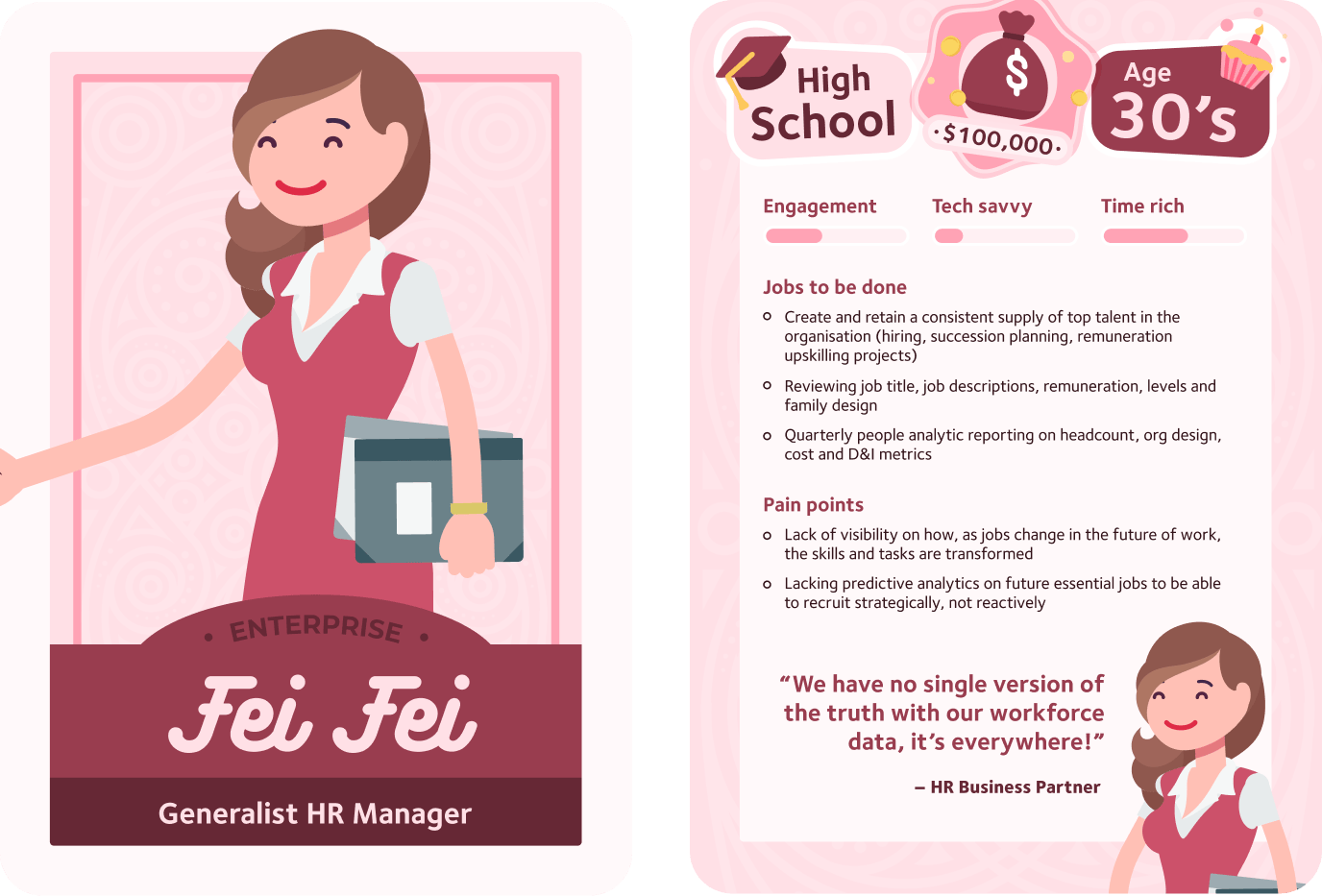
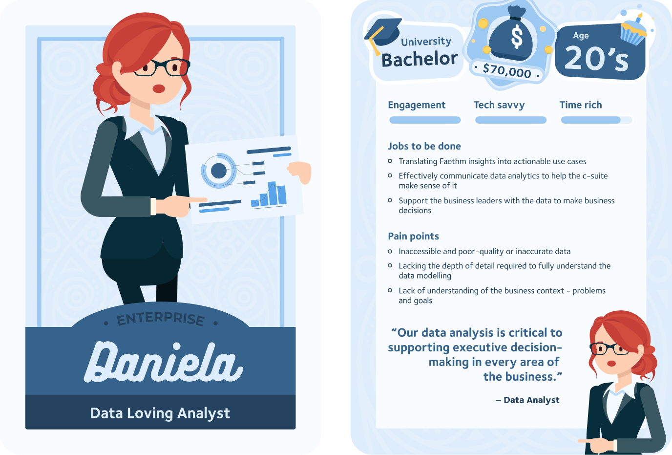
User Profile
To gain a deeper understanding of our target audience, we've created three distinct user personas. First, there's Robert, a seasoned Chief Human Resource Officer (CHRO) tasked with making strategic decisions for the organisation based on complex HR data. Then, meet Fei Fei, the Generalist HR Manager, who juggles a wide range of HR functions and seeks efficient data-driven solutions for HR processes. Finally, there's Daniela, the skilled Data Analyst, who specialises in handling intricate datasets and extracting valuable insights.
Each persona encounters challenges with existing tools, be it limited functionality or steep learning curves, in their pursuit of efficient data analysis and decision-making for their respective organisations.
Generating Possible Solutions
- Develop a library of diverse and comprehensive visualisations, including bar charts, line charts, scatter plots, heatmaps, and geographic maps.
- Implement consistent design elements and visual cues to ensure visualisations are easily interpretable and comparable.
- Optimise the library's performance to handle large datasets efficiently and provide real-time rendering.
- Simplify the configuration process by offering intuitive controls and providing smart defaults, while still allowing advanced customisation options.
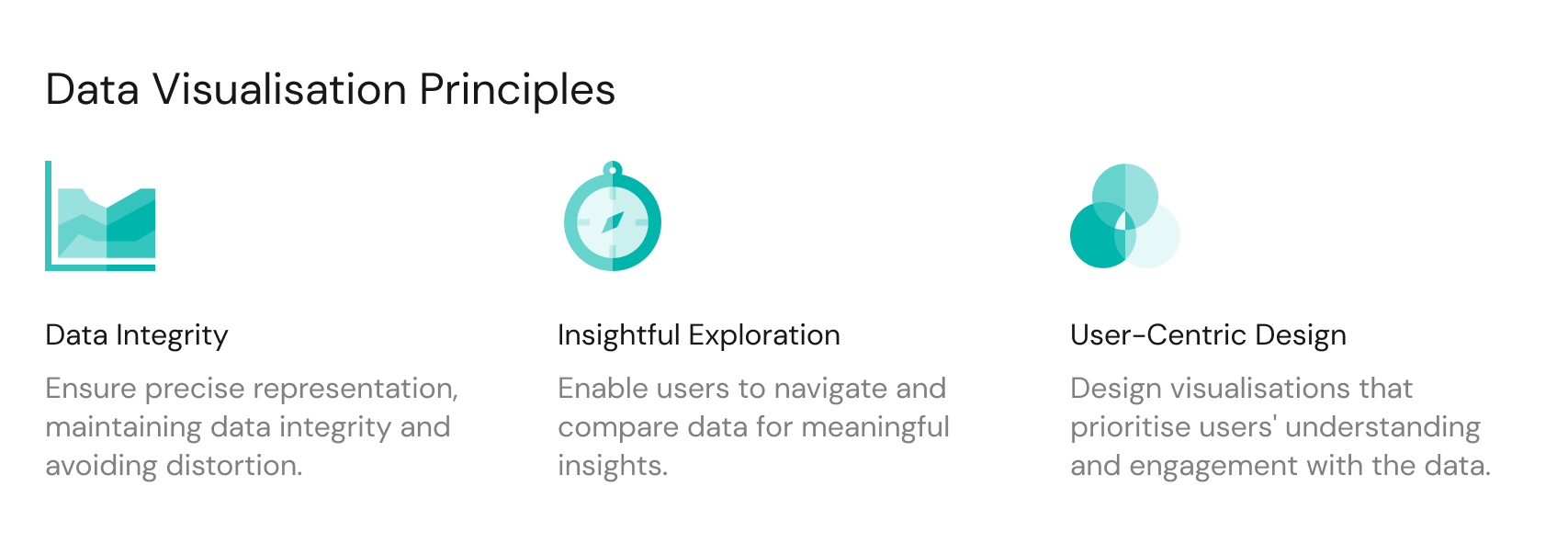
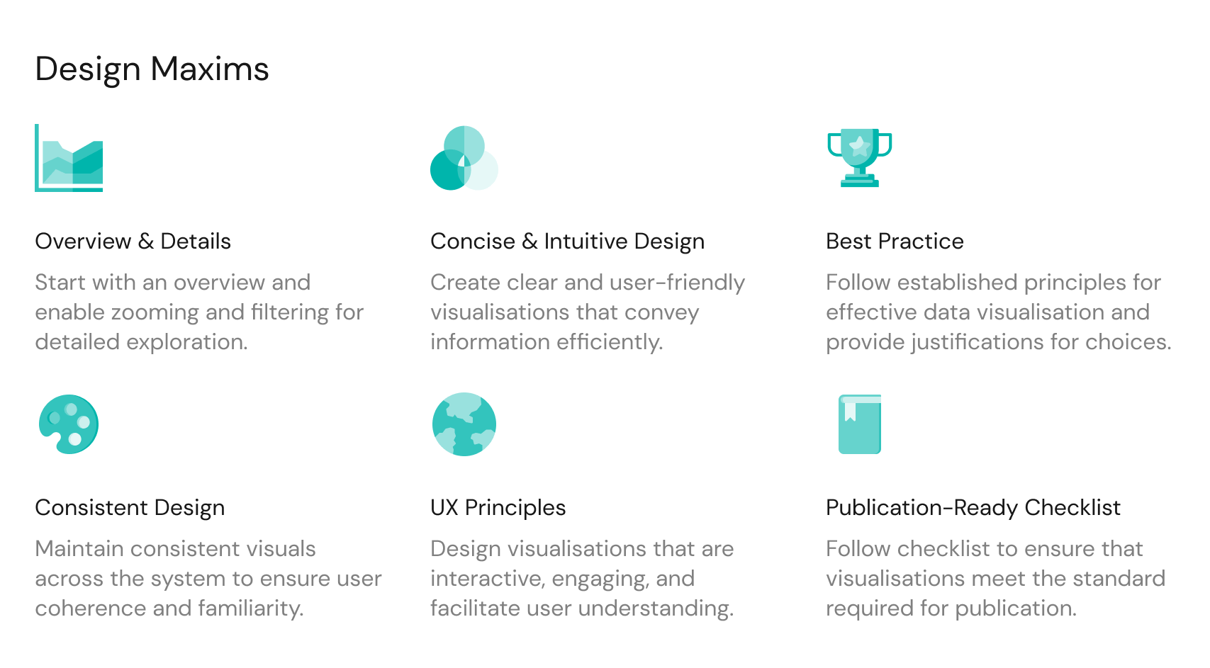
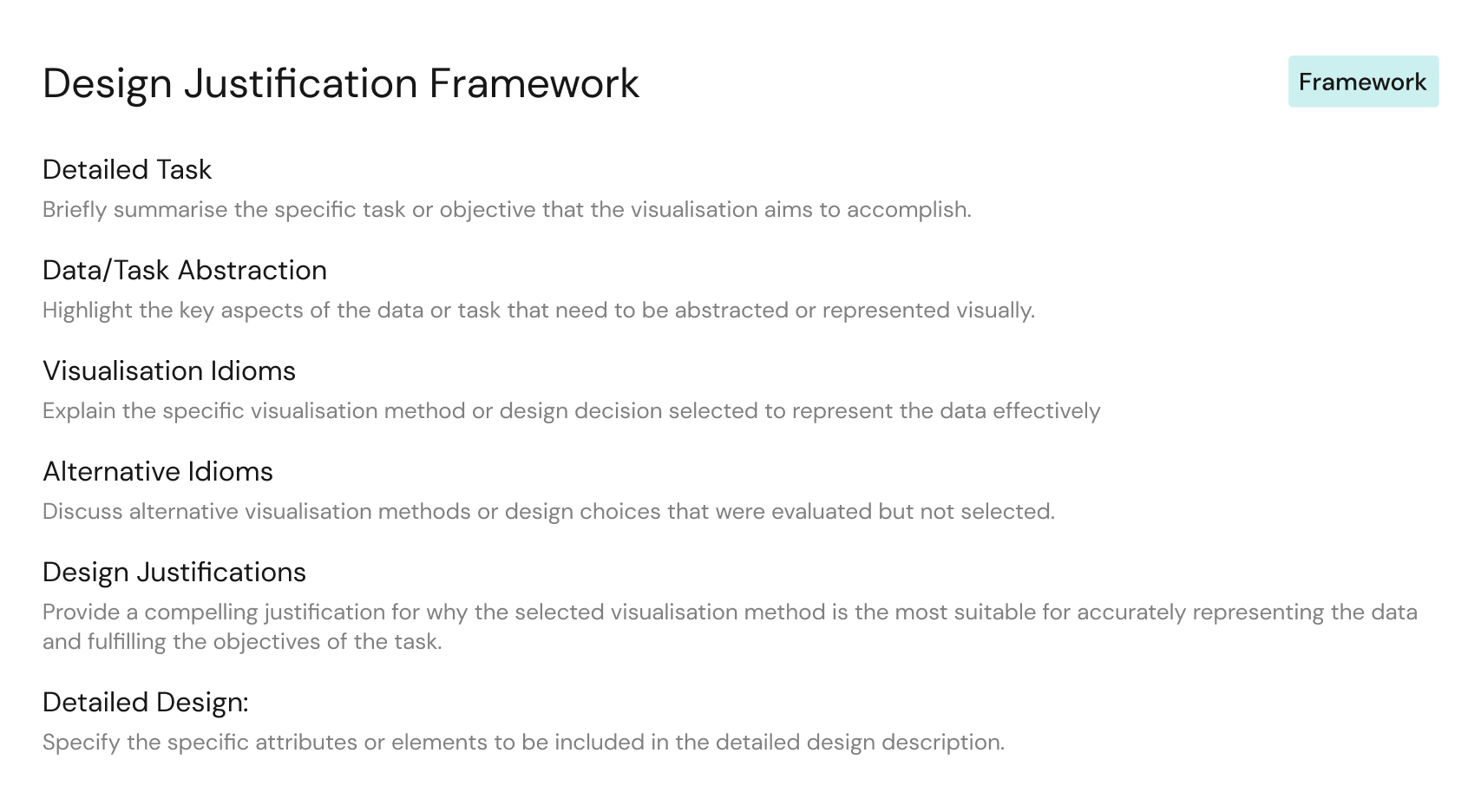
Setting Design Principles
Setting design principles were the foundation of this project. These principles form the guiding philosophy that ensures our data visualisations effectively communicate complex information, and ultimately enhance data comprehension for our users.
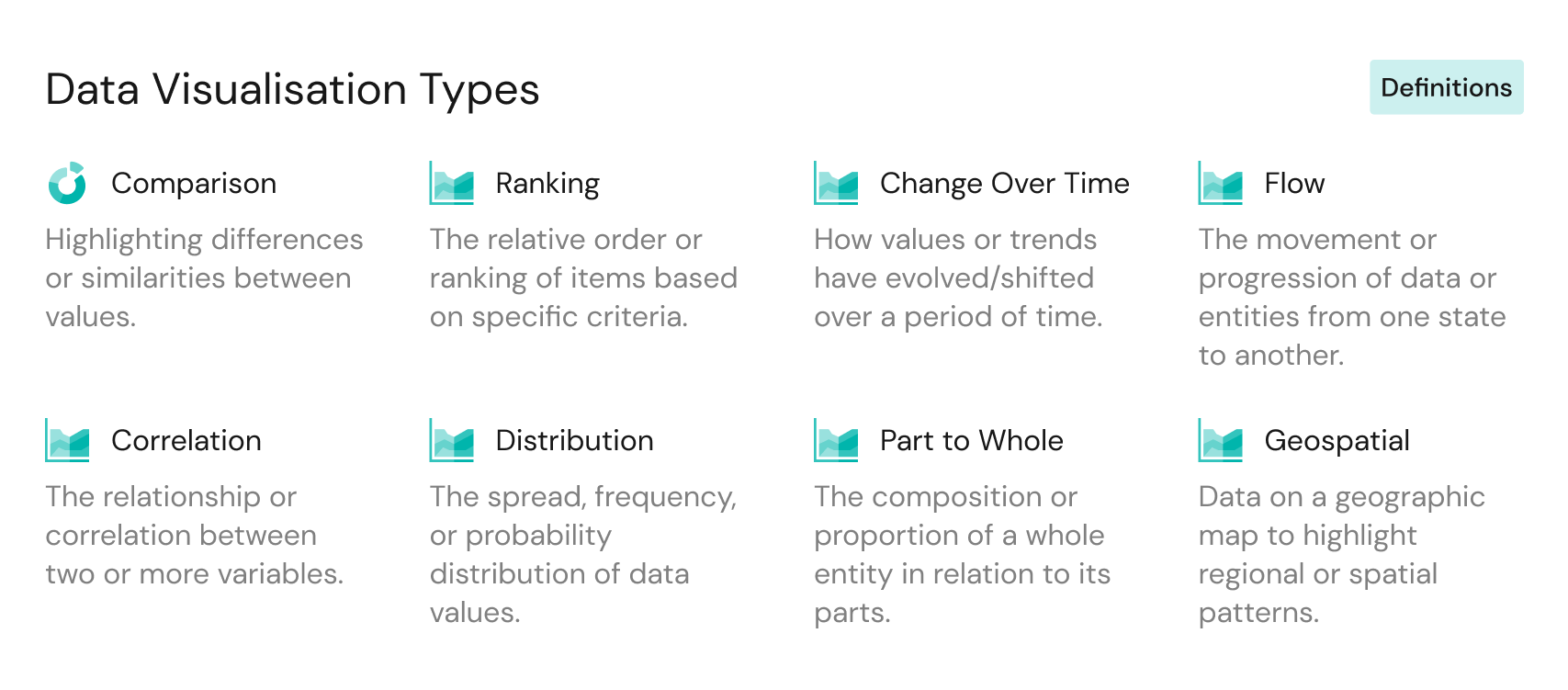
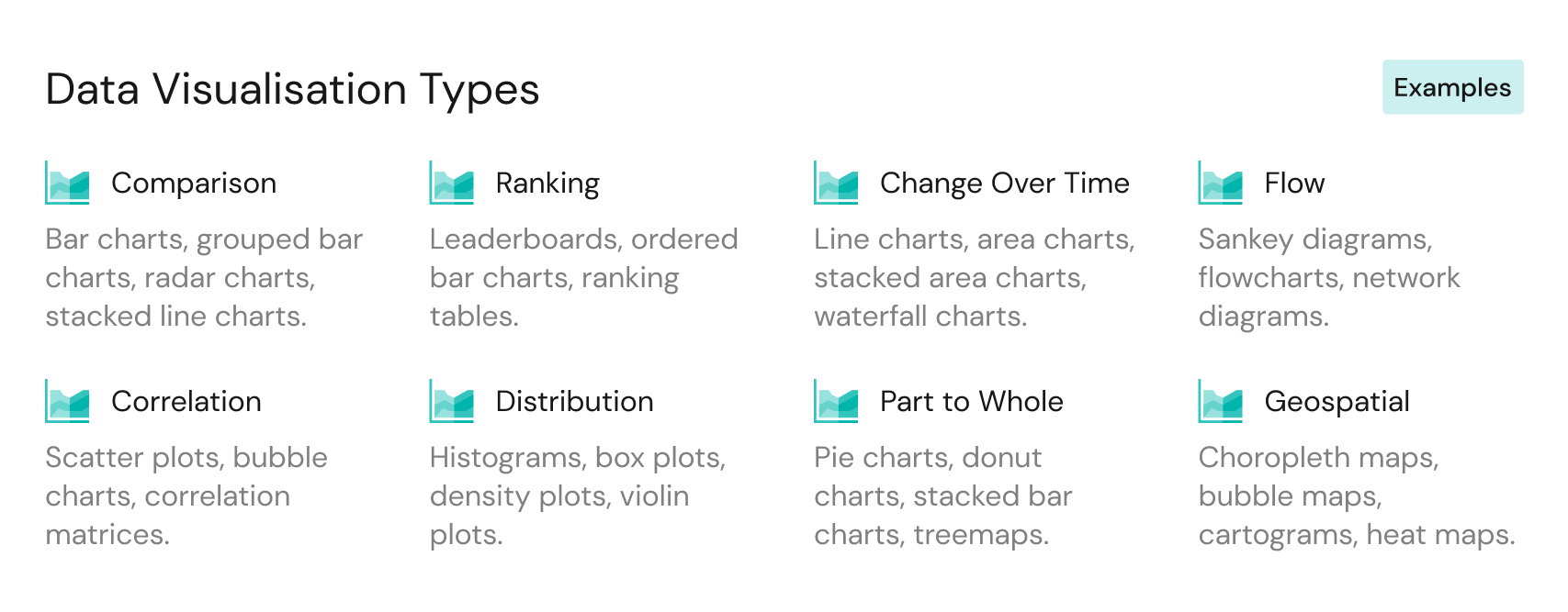
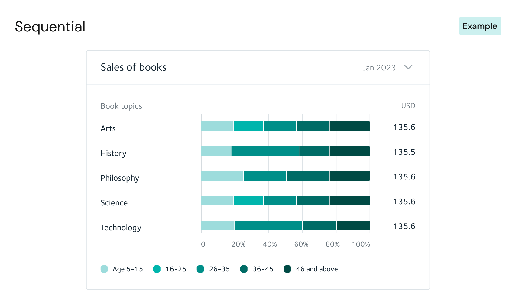
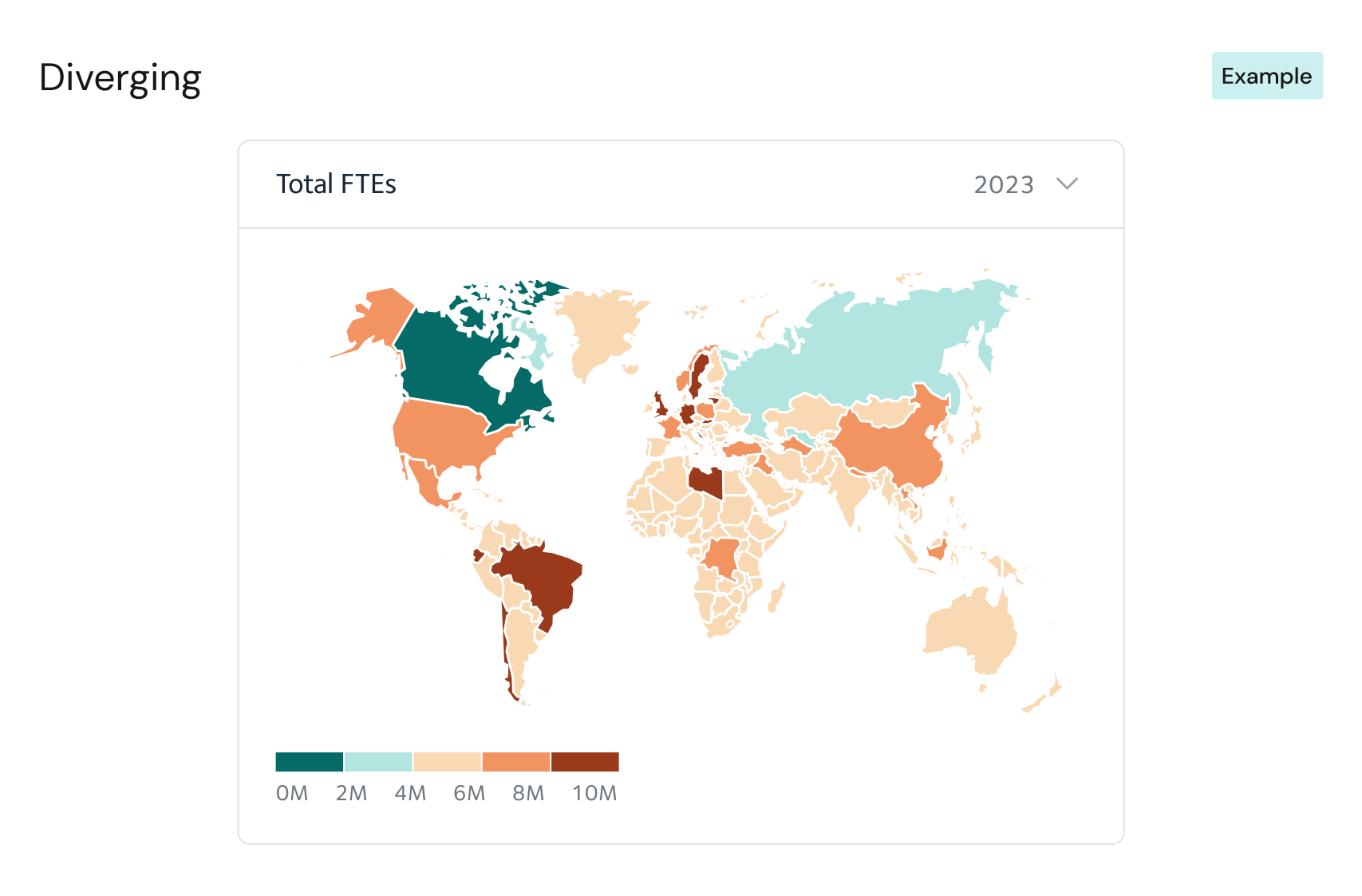
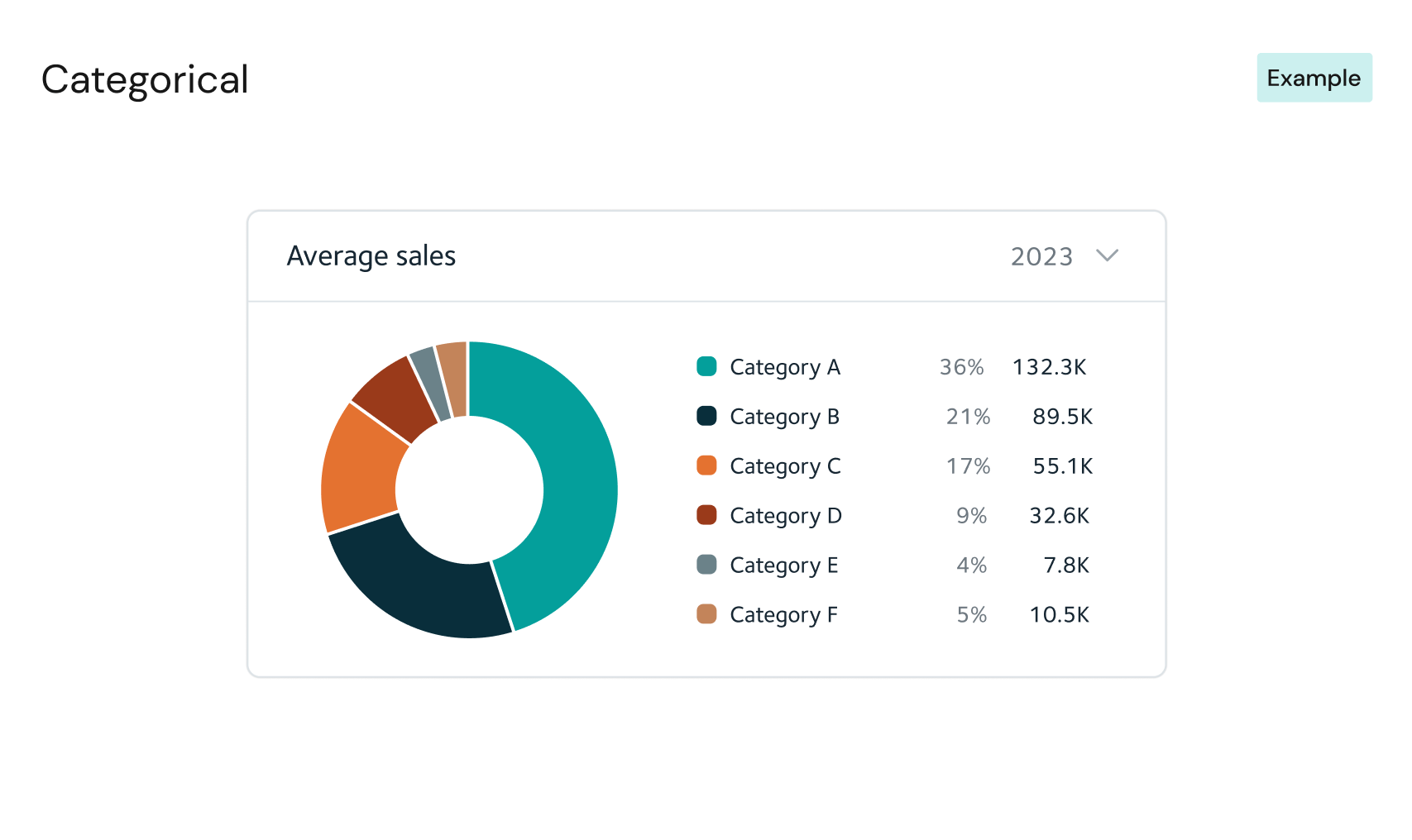
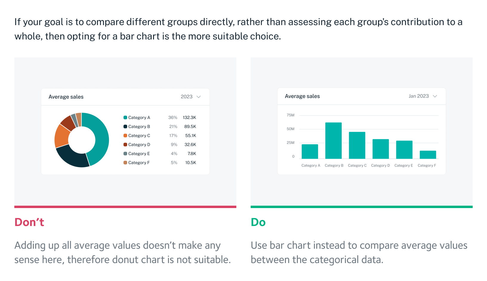
Choosing the right chart
Selecting the right chart type is paramount to our approach to data visualisation. We recognise that humans comprehend visual information better than text, and our goal is to simplify data interpretation. By offering a diverse range of chart options tailored to different scenarios, we are enabled to present data effectively and intuitively to our users.
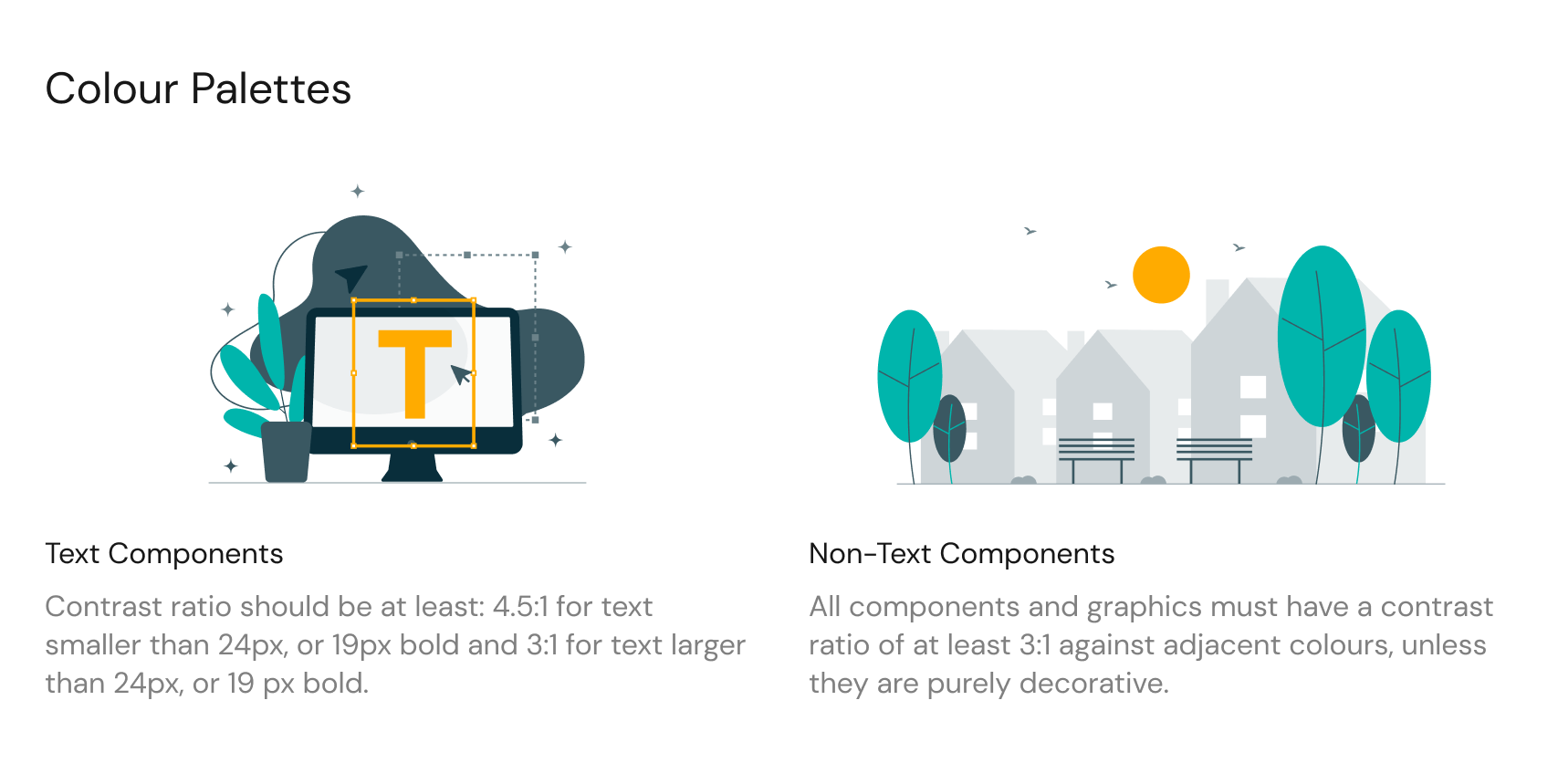
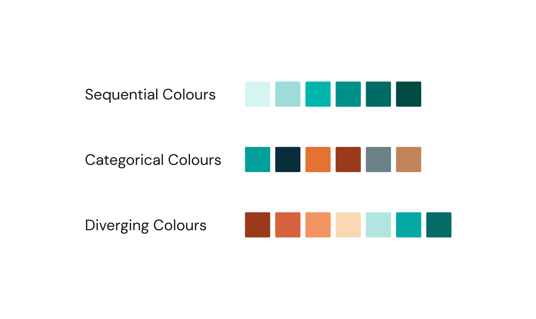
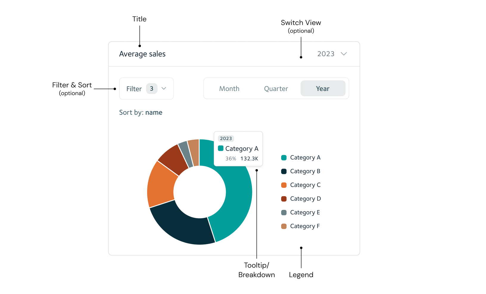
Color, Layout & Styling
Colours, layout and styling play a crucial role in data visualisation, their significance is due their ability to:
- Convey information: colours simplify complex data and make it memorable.
- Highlight patterns: thoughtful layout design guides viewers to discern patterns effortlessly, ensuring critical insights aren't missed.
- Differentiate data points: Styling choices like fonts and shapes help users distinguish data categories, making information interpretation more intuitive.
The Solution
Our data visualisation library offers a holistic solution to the challenges faced by data analysts and researchers. It's designed to provide an accurate, helpful, and scalable visualisation tool that empowers users.
- Wide range of visualisations: The library has a comprehensive collection of visualisations, both static and interactive, allowing users to interpret their data accurately.
- User-friendly interface: We've crafted an intuitive interface that guides users through the visualisation process while offering customisation options.
- Consistency and performance: Ensuring that design elements are consistent across different visualisations and platforms guarantees accurate interpretation and scalability.
- Documentation and support: We'll provide extensive documentation and support resources to help the team make the most of the library.
Summary
In summary, our data visualisation library addresses the challenges faced by data analysts and researchers, offering a user-friendly tool that adheres to data visualisation principles and design maxims. With its intuitive interface, diverse visualisation options, and emphasis on consistency, performance, and accessibility, it becomes an indispensable resource for data professionals.